How Budweiser’s “American Icons” Came Together for Super Bowl LX
For Super Bowl LX, Budweiser chose not to compete through noise, celebrity cameos, or quick punchlines. Instead, the brand leaned into its identity — heritage, symbolism, and visual storytelling. “American Icons” was developed as a cinematic piece rather than a traditional commercial, built around images that already carry weight in American culture.
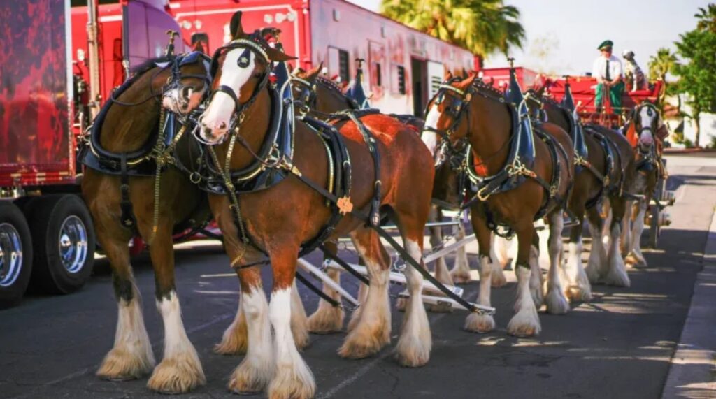
At the center of the concept are two long-standing symbols associated with the brand: the Clydesdale horse and the bald eagle. Both represent strength and freedom in different ways. Bringing them together was less about spectacle and more about continuity — reinforcing imagery that audiences already connect with Budweiser.
The creative direction focused on growth and resilience. Rather than presenting fully formed icons, the commercial begins with vulnerability. A young foal and a fragile eaglet are introduced against a rugged rural backdrop. The early scenes are quiet, grounded, and patient.
The setting plays a crucial role in shaping the tone. Wide farmland, storm clouds, open skies, and shifting light give the piece a natural, expansive feeling. The production favored real landscapes and organic textures to maintain authenticity rather than relying heavily on studio effects.
Weather becomes part of the storytelling language. Wind, rain, and harsh conditions aren’t obstacles for drama — they represent endurance. The animals are shown adapting and strengthening as time passes, reinforcing the theme of persistence without ever spelling it out.
The decision to avoid dialogue was intentional. Silence allows the imagery to breathe and keeps the tone universal. Instead of telling viewers what to feel, the commercial relies on visual progression and music to guide emotion.
Music selection was central to the project from early development stages. The team chose Lynyrd Skynyrd’s “Free Bird,” a track deeply embedded in American rock history. Its structure — beginning restrained and building gradually toward a powerful solo — provided a natural arc for the edit.
The pacing of the visuals mirrors the song’s structure. The early guitar lines sit beneath quieter scenes of the foal and eaglet finding their footing. As the tempo and intensity increase, so does the scale of the imagery.
Editing plays a key role in maintaining emotional control. Rather than rushing toward the climax, the commercial allows tension to build steadily. Each visual beat aligns with the music’s momentum, creating cohesion between sound and movement.
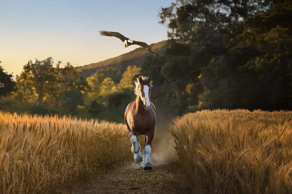
The defining moment arrives during the guitar solo. As the Clydesdale gallops forward and the eagle lifts into flight, the composition briefly creates a winged silhouette that many viewers interpreted as a Pegasus-like illusion. This frame became the most shared still from the ad.
That moment works because of timing. The music does not overpower the scene; it elevates it. The crescendo aligns precisely with the visual peak, giving the impression of release after gradual buildup.
When the commercial aired, audience response centered on emotion rather than analysis. Viewers described the spot as nostalgic, powerful, and cinematic. The pairing of iconic imagery with a culturally recognizable song amplified its reach across social platforms.
Unlike many Super Bowl ads that rely on humor or surprise, “American Icons” followed a slower, deliberate rhythm. Its impact came from familiarity and polish rather than disruption. That strategic choice distinguished it from louder competitors during the broadcast.
From a brand perspective, the ad reinforces Budweiser’s long-term positioning. The Clydesdales have appeared in the company’s advertising for decades, and the bald eagle strengthens the national symbolism. “American Icons” builds on that legacy rather than reinventing it.
The production scale reflects Super Bowl-level investment. Campaigns at this level typically involve months of planning, music licensing coordination, agency collaboration, and brand approvals. Every frame is calibrated to align with messaging and audience expectations.
In the end, the commercial succeeds because of alignment. The imagery speaks to tradition. The music carries cultural memory. The pacing respects emotional buildup. Nothing feels rushed or accidental.
“American Icons” stands as a polished, heritage-driven Super Bowl film that leans into identity instead of spectacle. Its strength lies in balance — epic without being excessive, symbolic without being heavy-handed, and emotional without relying on dialogue.
By the time the final image fades, the commercial leaves viewers with a sense of continuity. Not just a brand moment, but a carefully constructed visual memory designed to resonate long after the broadcast ends.